Showing posts with label art exhibits. Show all posts

September 4, 2025

Art Exhibit Season

My oil painting Still Life with Skull was awarded “Best Painting” in the 2025 juried exhibit of the Central Pennsylvania Festival of the Arts. The festival takes place every summer in the town that surrounds the campus of our Commonwealth’s university, casually known as Penn State. Just to have a painting chosen for this exhibit was nice. There were 346 submissions from artists across the state and only 47 pieces were chosen to be in the show. I will attempt to jury into this exhibit again in 2026 and defend my title!

Aside from the usual (and gratuitous) picture of myself with my work after the reception, my wife and I had a great time in the following days walking around State College and the beautiful Penn State campus taking pictures and enjoying the vibe of a university town, which was tangible even between semesters.

We also made sure to visit the fine drinking establishments situated just off campus, of which there are many.

At each stop we made sure to sample the beverages— purely for research purposes. The crowds were minimal so chopping it up with the bartenders was a big part of the fun.

More Exhibits:

Big Thanks to the thousands of, ... (OK five) people who visited my recent solo exhibit at the Elaine Biondi Gallery Space in Monroeville, PA.

Good thing I hauled enough pieces to hang there— the space was bigger than I expected. This overlapped with the Central Pennsylvania Festival of the Arts juried exhibit, so I did something I don’t usually do, which is get a print on canvas made of my State College submission to include in my solo showing. Below is another cheesy gratuitous picture of myself and a couple installation views.


A few days ago I submitted 3 paintings to be shown in the Southwestern Pennsylvania Council for the Arts 30th annual exhibition. Hopefully they’re accepted. That takes place in the Galleries of The Southern Alleghenies Museum of Art at Ligonier Valley, which is about an hour and a half away from my home studio. The opening reception is November 15th.

Holbein Biography Book:

The book I am currently enjoying is the biography of Hans Holbein which came out a couple years ago called The King’s Painter by Franny Moyle.

Outside of The Ambassadors and his portrait drawings, I didn’t fully consider and appreciate Holbein’s art until recent years. Aside from learning about Holbein’s process and techniques, the book does the one supremely important thing a biography needs to do when looking at a life and art from so long ago, and that thing is putting the subject and his work into the context of the their own time.

Mrs. Moyle’s book also discusses visual clues in Holbein’s paintings that otherwise go unappreciated. Similar to Holbein’s life, his art had to mean different things and give different messages to different people in order to keep everyone happy. In those whacked out days of Luther’s reformation and Henry VIII’s megalomania if you couldn’t walk a fine line it could literally cost you your head. Holbein was able to flatter his sitters, yet give some of them the stick on the sly at the same time, if you know what I mean. Here’s your face. Take that you rotten so-and-so!

Lastly I have to take my hat off and hand it to authors like Mrs. Moyle who write books like this. When I stop and think about the amount of time, effort, and expense it must take to research so much of the obscure correspondence, documents, and images, that informs the writing— let alone weave an enjoyable narrative of a life from so long ago, where the known facts are thin to begin with— is quite an accomplishment. So big props to Franny!

September 19, 2023

Postcards From Summer Exhibit

Here are a few postcards from the CrossCurrents regional fine art exhibit a few months back. This was before my recent shoulder surgery that made everything in general a little more complicated.


The Stifel Fine Arts Center was a former private home built in 1910 and sits just south of Oglebay Resort in Wheeling, West Virginia. The center is part of Oglebay Institute and engages more than 13,000 people each year with a full calendar of fun events.


This was the 43rd year for the CrossCurrents fine art exhibit and my first time displaying oil paintings there. Both pieces I entered were accepted. Pretty nice considering one of them was my first landscape painting in over a decade.


The next stop for both of my paintings will be my solo exhibit in Mt. Lebanon, Pennsylvania in October.

April 27, 2020

Michelangelo: Mind of the Master

This Covid world we now live in has me thinking of happier times - one recent time was at the Cleveland Museum of Art, where I enjoyed the Michelangelo: Mind of the Master exhibit. What a fantastic weekend.
Seeing these Michelangelo drawings up close for the first time after studying some of them in books for so long was, to say the least, a thrill. After the initial walk through the exhibit I went back and spent time in front of my favorite pieces.
The museum did a great job of putting the original drawings in context by showing them among  large reproductions of the finished paintings these drawings were studies for.
It was also fun to watch people try to find the matching figure in the large reproductions.
The exhibit catalogue is an interesting read because it tells the provenance of these drawings and points out specific items of historic and artistic interest about them.
Could not help feel that Michelangelo cheated us all by destroying so many of his drawings after seeing these few.


March 10, 2020

Three Swiss Guards - Aged Effect

This new piece was inspired by a past visit to the Vatican, and by the drawings of Michelangelo. On an early Wednesday morning in St. Peter's Square while waiting with the rest of the crowd for the arrival of the pope, I was taking in the scenery with my 300mm lens.
The Swiss Guards, along with the sculptures adorning St. Peter's Basicalla (above) were among the images I captured for artistic reference. Below is the initial mixed-media painting I created in 2016 from my main shot of the Swiss Guard.
A while after completing this painting, I was inspired to revisit this subject in either graphite or charcoal after seeing an interesting "aged-paper" technique in one of my fine-art books.
I had the initial drawing worked up on a nice piece of watercolor paper, but then put it aside to work on other projects. The drawing sat in my studio for over a year. What fired me up to finally complete the piece was a trip to the Cleveland Museum of Art to see the fantastic exhibit, Michelangelo: Mind of the Master.
After seeing so many of Michelangelo's original drawings and how beautiful they were on the 500 year old stained, pockmarked, and torn paper, I could not wait to finish my new Swiss Guard piece!

After spraying the final drawing with workable fix, I poured some instant coffee over it, crushed it, and tore it. After it dried, I took a piece of an apple and smashed it onto the surface of the piece, rubbing it in different directions, unevenly over the surface. I did the same thing with a carrot too. Finally I put the piece on a section of aluminum foil, lit a candle, and carefully burned sections of the edges.
To finish, I drew on top of that, adding a few details to the piece and darkening the darks. I tried to frame it as close as I could to the look of the way the original Michelangelo drawings were presented in the Cleveland Museum of Art.

February 6, 2015

Charles Courtney Curran Part 2

One of the two things that hit me while enjoying the recent Curran exhibit at the Frick was his obvious masterful talent at rendering radiant light. One way he achieved this effect is through his treatment of edges. Varied types of edges are supremely important in a good painting.

The image I shot below shows just a small part of one of Currans female portraits. Even in this small portion you can see a variety of hard and soft edges.


Part of how he achieves that glowing radiance with edges, is by raising the values of the background areas that are right up against the lit subject. This gives the effect of the light on the subject “spilling” into the background, much like what happens if you’re in a dark room looking at a window or door to the outside. Finally he also dragged the semi-dry brush (scumbled) with the lighter values right into the dark background, mainly in the hair.

Other than the radiant light, the second point that I kept seeing as I looked at the exhibit was the fact that much of the paint was applied so thin, yet was so effective in rendering three dimensional form. All great oil painters can achieve this, and it is something which is best seen by looking at original paintings, but I tried to shoot an example for you anyway.

The below image is a small portion of a very small painting done in Paris:


You can see many of the lines of Currans underdrawing right through the paint. In fact much of that color and value making up the pedestal is probably raw canvas or very thin paint.

When you look at some of Norman Rockwell’s originals close up as well, you see that his drawing skills were the foundations for the relative straight forward application of paint.

Even in the first image above (of the woman), her hair is rendered with a thin application of paint, some of which is so transparent you can see raw canvas. Yet when you look at it from a distance it looks like full-bodied hair rendered with thickly applied paint.

For a glance of how I try to capture the radiance of light in one of my own still life paintings click here.

To see more fantastic oil paintings by Charles Courtney Curran click here.

February 3, 2015

Charles Courtney Curran Part 1


Back in the mid 90s I picked up a book at the local Boarders book shop called “American Impressionism”. Flipping through the pages I came across a painting of three beautiful girls in profile, sitting on a hillside against a backdrop of blue sky and whisps of clouds with their hair swaying in the summer breeze.

What was most striking in the picture, and what has stayed with me ever since, was the radiant light bouncing from the girls white dresses into their faces and hair. It was as beautiful a rendition of radiant light as I’d ever seen, and that includes works from the French impressionists.

The artist was an American called Charles Courtney Curran, a name I would never forget, but an artist whose work I thought I would never get to see in person. That all changed recently when I attended a fantastic new exhibit of his work at the Frick Art Museum in Pittsburgh called Charles Courtney Curran: Seeking the Ideal. The exhibit was three rooms of his amazing small and medium-sized oil paintings.


Below are two views I shot of the painting described above, none of which do justice to this amazing artist whose talent certainly rivals all his contemporaries, including the great John Singer Sargent.

“On the Heights”, oil painting by Charles Courtney Curran


“On the Heights”, detail

March 17, 2014

Designing For an Exhibit

Right now I have a solo exhibit going on in Mt. Lebanon, Pennsylvania. Since it’s in the large (thankfully heavily traveled) public library there, I not only have total control of how work is hung but also how all the supporting material looks.

Some of the 23 paintings included in my current exhibit.

Designing all the print materials that enhance the exhibit and give information to viewers, if done properly, is time consuming work. Stuff like a bio page, painting identification tags, wall signs, artist statements and business cards should look professional and be somewhat visually tied together.

No matter how good your art might be, blowing off this part of an exhibit, or rushing through it, screams out “amateur” to all who look at the finished exhibit.

Of all the pieces I designed for this particular exhibit, my new business cards took the most time. Business cards seem simple but, there are just so many choices and details in designing them that I wear myself out. Plus the fact that since I decided not to have a “sample sheet” for folks to take this time around, business cards are the only thing viewers can really take with them - and believe me, they do.

My old business cards used an image of one of my paintings which has since been sold, “Urn with Fruit”.

The old card with the sold painting.

In the new business cards I thought it would be cool to zoom in to show the texture in my paintings. I also decided to use several of my paintings, and cut the amount of copy on the card, while breaking a cardinal rule of graphic design - actually making the copy... (gulp) larger.

The end result is a varied collection of cards, with a more impactful look that keeps my typefaces consistent with various existing supporting materials.

My new business cards

Here's my favorite which I'll probably use in future exhibits:


June 24, 2013

Art For A Hire Purpose

I recently submitted my three hood ornament still life paintings to be juried into the Pittsburgh Society of Illustrators upcoming exhibit “Art for a Hire Purpose”.

One was accepted - the most recent one painted which is titled “Roadster” and is the featured piece in the image below.


I was disappointed that all three paintings did not get in, but considering the immensely talented artists in that group, I’m not surprised.

Come see the exhibit at the Art Institute of Pittsburgh gallery. It opens on July 7th!

April 22, 2013

New Exhibit, New Brochure

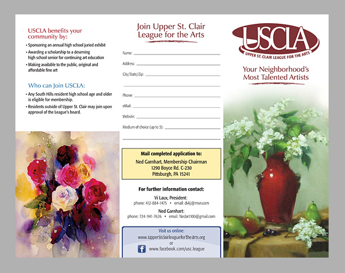
A few posts back I mentioned I got tapped to design a brochure for a local artist group I’m with here in the southern hills of Pittsburgh - the Upper St. Clair League for the Arts.

Well the brochure is printed and none too soon because the Upper St. Clair League for the Arts Annual Juried Exhibit opens this Friday  evening the 26th.

The venue is the Galleria of Mt. Lebanon and over 50 pieces of new original art will be on display, including my three newest oil paintings. The opening reception is at 7:45.

And here is the art league’s new brochure, which was printed by vistaprint.com. Pick one up for free at the exhibit!

cover

partially opened

entirely opened

 entire backside

March 21, 2013

Cherry Design Job

I had planned to follow up on my previous post by writing about the joys of looking at old vinyl album cover art and sharing some links that show some of the more classic, illustrated covers.

That got put on hold however when I got tapped for a fun little project, the design of a brochure for a local artist group I’m with here in the sunny southern hills of Pensylvania - the Upper St. Clair League for the Arts.

As of this writing it’s going through rounds of minor revisions by fellow members of the group who can spell properly, but we’re planning on having it done for our annual juried group exhibit in late April. Anyway, below is a little teaser of what it will look like:

Brochure cover and partially open inside spread.

No, I didn’t use my own painting on the cover. That’s the work of one of the best oil painters in our group, Diane White. Click Here to check out her website.

I’ll post the rest the brochure upon completion, and post more Art League-related links as well!

March 4, 2013

An Exhibit For Whites Only

Settle down people, it’s not what you think! I’m talking albums here - as in the Beatles “White” album.

“The Beatles” LP from 1968, better known as the “White” album.

I’m a huge Beatles fan and while reading my favorite blog about them the other day, I came across one of the most unique “exhibits” I’ve ever seen. There is a guy who collects first editions of the White album, no matter what condition they are in. He’s got loads of them and they’ve been on display for a couple months now at Recess Gallery in New York city.

 A shot from the NYT article on the exhibit.

What is interesting is a lot of the copies have the previous owners marks on them. Marks like scribble, love notes, artwork etc... making an already iconic album more unique because there is such a personal story attached to each one.

The White album is amazing and it is this guys passion. Here are two interesting articles I suggest you read about the exhibit:

The New York Times

DustandGrooves.com

Click Here for that Beatles blog I mentioned.

Doesn’t matter whether or not you like the Beatles (but how could you not?), it’s all in the name of art!!

Settle down people.

June 1, 2012

Leonardo da Vinci Exhibit

Are you a devotee of da Vinci? An admirer of anatomy? A disciple of drawing? Or all of the above?

Well, after you’ve helped the rest of the UK to celebrate the Queens diamond jubilee this month by attending the McCartney concert at the Victoria Memorial, I suggest you remain in London for a few more days and go see an exhibit called “Leonardo da Vinci, Anatomist” at the Queen’s Gallery, Buckingham Palace.


Among the items on display are ground-breaking anatomical drawings that were thought to be lost to the world. Leonardo was skilled in so many areas of interest that it’s tough to fully appreciate his contribution to various specific disciplines of today.

One thing is certain however, he sliced up more than a few cadavers in his day (must’ve smelled fantastic) and the detailed drawings which resulted from those slicings were ground-breaking stuff as far as human anatomy goes.

If you want to avoid the rigors of travel to see the exhibit, you may like to view the entire collection by simply clicking here.

And of course there’s even a “Leonardo da Vinci: Anatomy” app you can get for your all new iPad.

JoeWinklerArt.com

May 14, 2012

Postcards From the Exhibit

It took much work to put together from all involved , but the opening reception of my Shaw Galleries exhibit was an enjoyable evening for sure. Here is a postcard from the opening last Friday evening:


Here are shots taken the night before, just after setup showing just some of my work:


The exhibit will be extended through the end of this work week (Friday, May 18th), so if you are in the city of Pittsburgh, stop by! Click here for Shaw gallery location.

All of the local news outlets made mention of the opening of the exhibit in their Thursday or Friday editions. Below is one such blurb from the Pittsburgh “City Paper”.  May have been a good thing or not, that it ran across from an ad for one of Pittsburgh's finest "gentleman's" clubs!


JoeWinklerArt.com

May 7, 2012

Solo Exhibit in Downtown Pittsburgh

My solo exhibit at Shaw Galleries in downtown Pittsburgh is nearly here! The doors open this Friday, May 11, at 11 in the morning. The public reception will be that evening, from 5 to 8 pm. Around thirty of my paintings will be on display.

Here’s your special invitation so you don’t feel left out:
(you don’t need to have it with you upon entering!)


If you can’t make it to the reception that night, my paintings will be on view until the end of day, the following Tuesday, (May 15th). If you would like me to walk you through my work in person, just contact me, and I’ll be glad to meet you at the gallery on Saturday, May 12th.

“A” marks the spot of Shaw Galleries in the map image below:


The gallery address is: 805 Liberty Ave. Pittsburgh, PA 15222.
The best place to park is the Ninth Street garage, which you can enter from Liberty Ave. just past the gallery. If you take the subway, hop off at Wood Street Station in the city.

Hope to see to you there!

JoeWinklerArt.com