Here are a few postcards from the CrossCurrents regional fine art exhibit a few months back. This was before my recent shoulder surgery that made everything in general a little more complicated.
September 19, 2023
Postcards From Summer Exhibit
August 15, 2023
Lorenzo De Medici drawing
Here is a recent drawing I did from one of the many reference photos of busts and sculptures I shot on trips to the National Gallery in Washington D.C. This is Lorenzo De Medici (Magnifico).
I Used Generals 2B charcoal pencil on this crazy paper that looks like canvas, but feels like plastic. I got the paper at the ad agency I used to work for. It was on a pile of sample pieces of paper that a sales rep had dropped off years before. It was going to be thrown in the trash, so I salvaged it. Really tough to get a wide variety of values with it, but sometimes that can be good since all you need is three values for an effective drawing.
Sometime I will draw directly from sculptures while in a museum, but I always shoot reference anyway. When shooting reference like this in a museum, never get up close, and preferably don’t use your phone. The image gets skewed too much I feel. The right way to shoot sculpture busts is by doing what good portrait photographers do— stand back as far as you can and use a long zoom lens to bring your subject in close.
The lens I use is 210mm, but you don't need to be that far away. Another tip is to try to include something in the frame that you know to be true, like the edge of a wall or doorway to the next gallery. That way you have a plumb line of sorts to guide you when processing and straightening the image as needed before drawing it.
Lorenzo De Medici was loved by some, hated by many, and ruled late 14th century Florence like a mafioso at time when the city was losing influence to Rome. But dammit he kept bread prices low for the working class! His family home is now a police station, which is probably why our tour guide wouldn’t take us inside.
December 14, 2022
Pewter and Pear Painting
As promised, below are a couple progress shots of this little 5x7 painting I recently completed. The pic below shows pretty much my view of the subject as I sit at my easel. The surface for this is a hard, pre-primed board that I taped to a piece of black foam-core so I can paint the entire surface to the edges. What is behind that, is just an extra easel that I placed there to keep from getting blinded by my spot light hitting the subjects as I look at them. I didn't use a box for this set-up and my eye sight isn't great so I like to sit as close to the subject as possible when painting from life. This 5x7 board has been around my studio for years - Notice the lines of another still life which I never went forward with drawn under the paint. Centuries from now someone will x-ray the finished oil painting, notice that, and scholarly essays will be written about it... O.K. probably not!!
Below is the initial color block-in. I like dark rich backgrounds, so that old sheet in the setup became dark and rich. The pear is plastic, and I'm using that as my excuse for it looking more like a light bulb at this stage. The truth is, I am sadly out of practice drawing with my brush. I would much rather set down a loose but accurate pencil or charcoal under-drawing and go from there. I wanted to try something different this time and not do that. I would have loved to finish this piece in one sitting. I really respect painters who can do that. However, my working method over the years has been to go back, rework, and glaze certain parts that need tweaked.
Below is the final oil painting. Perhaps I will be happier with this result once I "oil out" the painting, which will make the sheen uniform across the entire surface. Basically that process consists of putting a bit of Winsor & Newton Painting Medium on a foam brush and quickly brushing it over the whole surface making sure it is all covered evenly.
Notice the odd looking areas of the background to the left of the cup handle, and to the right of the pear. Uneven application of painting medium when I was reworking those areas caused that. "Oiling it out" should fix that. Finally, in two to three months it should dry completely and be ready for my solo exhibit next October.
December 13, 2022
Bust of Victory
Of all the still life subjects I have collected at antique fairs over the years, this early 20th century French bust of Victory is one of my favorites.
Recently I lit it and rendered it in charcoal on a piece of tan canson paper. The base it sits on in the pic below is actually a marble lazy Susan and not part of the bust itself. I use that a lot when doing busts like this because its so easy to turn and sketch at different angles before starting on a final piece.
Here is the final piece that was inspired by some John Singer Sargent charcoal portraits I saw recently.
February 21, 2014
Chess Pieces - Finished Painting
This piece will be included in my new solo exhibit coming up in March.
After finishing this piece, for the first time ever, I went through the simple “oiling out” process.
What that entails is gently rubbing artist medium (Winsor Newton artist medium) all over the dry painting. What this does is bring an overall, even “sheen” to the piece. Without this step some areas are left a bit glossy while others have a matte finish when the painting is dry. Varnishing the painting in that state most often makes that problem worse.
Previously I would mix my own semi-gloss varnish using Winsor Newton varnish. But oiling out before varnishing is much better. Now I have the option to varnish the painting if I want, or just leave it as is.
For a video from Winsor Newton on how to properly oil out, click here.
February 6, 2014
Step Three
Got to develop the knight and make a few overall tweaks and twerks.
May 14, 2013
A Painting Within a Painting
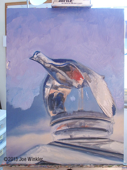
I've been shooting reference images of classic cars for years and I initially was going to execute paintings of entire cars. At some point that idea morphed into what I thought would make a more interesting and powerful composition - zooming in on one elegant piece of the car and painting that one element.
The fun thing is, the undulating curves along with the reflective nature of these hood ornaments causes them to really distort their surroundings which allows me the freedom to execute an almost abstract miniature painting within the larger painting!
April 27, 2013
Steeler Still Life - The Lights
The reason that folks like this piece (even if they don’t care for the subject) is the quality of the light. It’s luminous.
Luminous light like this happens in reality when a highlight hits a subject that is on a dark background, and the highlight is so intense that the light “spills” over the edge of the subject and softenes the subjects edge. The light that spills over the subject is then diffused onto the dark background making it lighter. The overall effect is one of a soft glow, with a hard light in the center.
Luminous light like this happens in oil paint when you avoid putting down a hard-edged daub of white paint while ignoring how it affects the surrounding areas. Those type of highlights work only on certain objects, like on a porcelain vase for instance.
I believe this luminous effect is acheived most pleasingly in oil paint, much more so than any other medium - Part of the reason I’ve been in love with oil paint for over a decade.
In actuality the light wasn’t all that intense when I set this scene up and lit it in my studio, but I knew it would make a pleasing effect when I rendered it properly in oil. Besides, true artists never merely copy their subjects. They always impart their own feelings into their work by whatever means they can.
February 22, 2013
New Painting Almost Done
Quick shot with little color correction done, but you get the idea. Scroll down a while to see the previous steps for this oil piece.
The finished painting will be in a juried group exhibit this spring and I’ll release a nice image of the final piece, along with those exhibit details closer to that time.
Cheers!
JoeWinklerArt.com
January 16, 2013
Next Oil Painting Step-By-Step
Instead, here are two quick, (read - not very good) JPGs showing step-by-step oil painting progress of my current, classic car hood ornament, still life painting.
Refined the underbelly of the bird this time, and established the darkest values.
JoeWinklerArt.com
January 7, 2013
Heavy Metal
October 19, 2012
Another New One
Ever hear of the classic board game called "Risk"? Thought so. That's what these are from. The red is one of the "attack dice".
This and the oil painting from a couple posts ago mark my latest attempts to work a bit looser. I loaded on the paint quickly with a bristle brush, then finessed some edges with a sable brush trying not to over work it.
One final note for today, this blog will be on vacation for a couple weeks. So if you live in the western Pennsylvania region and have questions or comments after seeing my painting exhibit at St. Clair Hospital in Mt. Lebanon PA, send me an e-mail at joe@joewinklerart.com and I will attempt to connect as soon as I can.
In the meantime, click HERE to virtually travel with me on my trip!
JoeWinklerArt.com
October 2, 2012
New Painting
The idea for this comes from a colored pencil rendering I did for my "Sketchbook Project" 2011 book which you can view on my Facebook pages.
The working title for this was "We're Number One", mainly because it reminded me of once seeing an old clip of ABC’s Monday Night Football where the camera was panning the crowd and a fan - realizing he was on camera - promptly flipped America the bird, to which Dandy Don Meredith adeptly commented “Aww, he’s just saying ‘We’re number one!’”
JoeWinklerArt.com
August 2, 2012
Summer Sketches
Just darkened up the darks a bit, and used white charcoal pencil to “heighten” the very lightest highlights. I decided (probably mistakenly) to ad a bit of color to the Steelers football one.
This is a commemorative 75th anniversary Steelers “mini-helmet” by the way - which is why I have the splash of yellow highlight there. And of course every Steeler fan would know the significance of the numeral on the jersey.
JoeWinklerArt.com
July 17, 2012
Tennis As Art - Part 3
This painting is a good reminder to myself of how challenging the set-up stage can be of even the most simple still life. Probably a product of there being so many possible compositions for these subjects in a 5x7 format.
This is where the "thumbnail" sketch comes in handy. Set the thing up, light it, sketch it in under two minutes, and decide if the composition works or not.
JoeWinklerArt.com
March 23, 2012
Red Wine and Bleu Cheese
“Red Wine and Bleu Cheese” step 3
One other item, I just secured a two day stint for a solo exhibit in a gallery in downtown Pittsburgh later this Spring. This painting will be part of that exhibit if I don't totally screw it up. Details to come soon!
JoeWinklerArt.com
February 13, 2012
Say “Wine and Cheese”!
After tweaking the composition on the computer, and transferring the drawing down accurately, I then spray the pencil lines with Krylon fix so they won’t smudge. Next I coat the surface with acrylic matte medium, which goes on milky-white, but dries clear which allows me to do the block in stage seen below.
Tell you a secret though, I didn’t use oil paint at this stage. I used raw umber and black acrylic. That’s the only time I ever use acrylics, as quick under paintings. Sometimes I’ll do a color block in at this stage, but I envision a very muted and limited color scheme as the finish state of this piece.
This composition originated from many reference photos I shot at an office party a couple years ago.
WHAT?! You’re not allowed wine at your office gatherings? How unfortunate for you!
JoeWinklerArt.com
January 25, 2012
Another Start of Another Oil Painting
Either way, along those same lines, here is step one of another new oil painting I’ve got going on:
Come now, you must know what vehicle this beauty sits atop!
Answers to both will come next post.
JoeWinklerArt.com
August 29, 2011
Salt and Pepper
"Salt and Pepper"
Totally going for the alternate meaning/play on words, and a bit of whimsey in this piece that will bring a chuckle (if not a full blown snort) out of the viewer. I like the fact that my realistic and drama-lit way of painting it contrasts with, and twists that humor.
To me what really makes this composition work is the little girls gaze.
In any painting with a figure, the viewer's eye is going to follow the path that the main figure is looking. Then the viewer's eye sees what the subject sees and automatically flows right back to that main figure, thereby holding the viewers attention for more than a mere second or two. And really, isn't that the aim of every good painting?
Well certainly!
JoeWinklerArt.com
August 16, 2011
Selling "Urn with Fruit"
"Urn with Fruit" 9x12 inches
This painting is a good example of where much of my art is headed - fun and elegant still lives where I can control the entire setup, lights and all. They're not all going to be fruit of course!
I paint because I enjoy painting and I like to enjoy the fruits of my labor beyond monetary gain. Selling this piece was bitter-sweet for me because I became emotionally attached to it.
The fact it sold because someone appreciates it as much as I do meant a lot. I had a great deal of fun executing it, then got to enjoy looking at it myself for a couple of years on my wall before selling it. That is the exact scenario I'd like to have for every piece I create!
JoeWinklerArt.com